.info
.process
My roommate, Rowan, and I spent the summer developing a proposal. We wrote a detailed game design document that outlined what we thought would be the best experience. the Our pitch was ambitious: a browser-based, mobile game that utilized the gyroscope as the primary control mechanism, with real-time lighting and moderately complex 3D models. This was uncharted territory, as mobile technology has traditionally been limited, especially in the browser, where memory constraints have often been too low to create anything interesting.
Prototyping
Once we sorted out the logistics, I began prototyping the basic interactions from a game design and technical perspective. I wanted to get a rudimentary version in the hands of the Coach team as soon as possible to gauge its engagement potential. The first hurdle was to grant Unity WebGL access to gyroscope/accelerometer data, which was somewhat challenging in the browser.
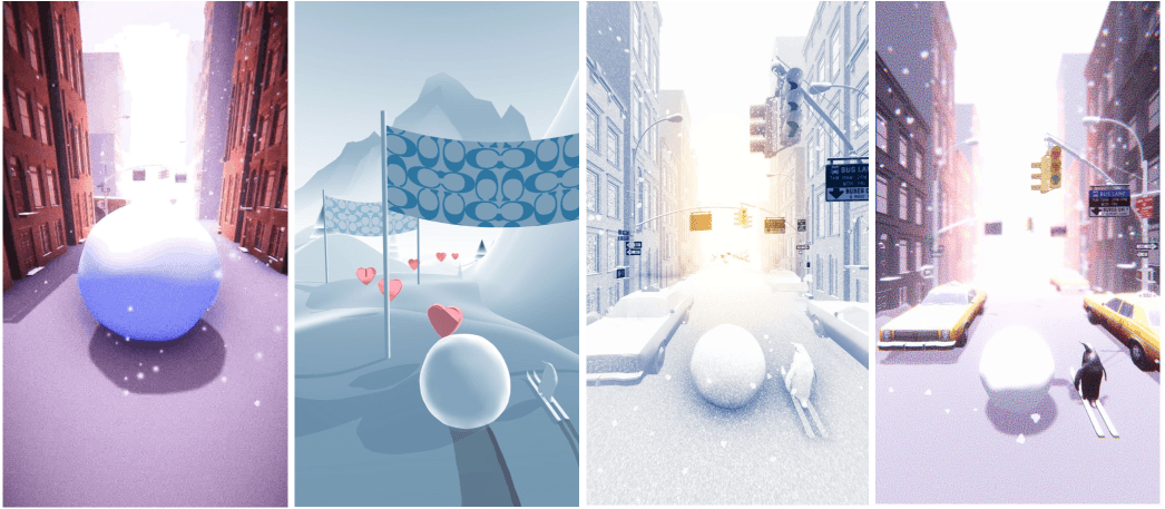
After that was up and running, I had to massage the values given by the accelerometer into numbers that felt good for the snowball physics. With the snowball moving decently, the other broad strokes of a Video Game started to come into place— a basic procedurally generated level, an intro moment, and a goal: collect as many hearts as possible. Dave and I were playing a lot of Sayonara, Wild Hearts at the time, so we took inspiration from there. We knew we couldn’t do anything as beautifully stylized due to browser and other limitations, but we loved how simple and effective the mechanic of collecting hearts was.
We encountered major technical issues during the visual development phase, leading to frequent crashes caused by memory overloads. The exact cause was difficult to pinpoint; it could have been due to several factors, including the realtime lighting, the dense 3D topology, the number of 3D objects, or texture memory. This happened about a month or two before the release date, and Coach was expressing a lot of concern and pushback. To address these issues, we enlisted the help of a development partner and Coach’s 3D Designer to analyze the game's assets and optimize them. We found that the Coach store 3D model we received had bag models inside it that weren't visible but still had millions of polygons, and that the UI textures were also uncompressed, among a bunch of other smaller issues. After a few weeks of optimizing the experience and assets, the game ran surprisingly well on various devices, both new and old.
Preparing for Release
Snow City was set to be released alongside a bunch of different retail activations worldwide. Not only did each version need to have region-specific features, but the copy and other documents related to giveaways etc. needed to be translated accordingly. I worked with my producer at Coach to create a spreadsheet where each region submitted their translations and desired game format (each region had a different approach to gifting the top X players). I then developed a couple different versions of the game to cover each use-case, and a system for easily updating UI and other game copy. 30+ github branches later, each version was translated and formatted in preparation for release. I QA’d builds, copy, and documents with the help of the team at Coach and each regions digital team, fixing mistakes as they came up.
Finishing Touches
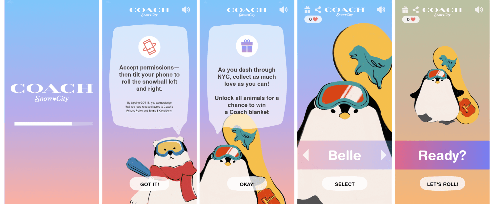
At this stage, the game was nearly complete, but we felt that the overall experience was missing something conceptually. Although the visuals aligned with the campaign, we needed to develop a stronger narrative to complement the gameplay. To achieve this, I collaborated with an illustrator to create a series of "Coach Animals" - various animals donning pieces from the campaign. These animals became a significant driver of engagement, providing a focal point for the experience. Mechanically, they helped explain the game while also serving as characters that players could unlock through multiple playthroughs. Ultimately, they added a new dimension to the game and enhanced the overall player experience.


